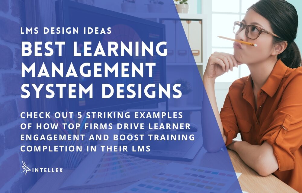
Getting employees to engage with training materials can be challenging. Firms that succeed in this area prioritize user experience and LMS design to boost training completion.
The highly customizable Intellek LMS platform has become a standout solution for organizations looking to increase training participation through thoughtful design. Let’s explore five real-world examples of how top law firms are using their learning management system to transform training programs from obligatory to engaging.
IN THIS ARTICLE...
Why smart LMS design drives Training Completion
The right learning management system design does more than look good – it gets real results. When training looks clean and makes sense, people actually want to use it. Workers start to see training as helpful, not just another box to check. They finish more courses because they find value in them. L&D teams who can’t get staff to complete courses should take note: good design turns training avoiders into eager learners. It’s that simple.
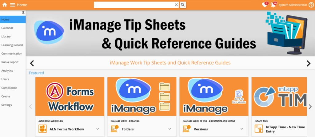
What does a good LMS look like?
A good LMS looks like something people actually want to use. It feels familiar and comfortable, not confusing or overwhelming. The best learning management systems blend seamlessly with your company’s visual identity while maintaining clean navigation and clear content organization.
From the examples you’ll see in this article, effective LMS designs share key characteristics: visual consistency throughout the platform, thoughtful color psychology that invites rather than overwhelms, custom imagery that feels personal to your organization (not generic stock photos), and intuitive icons that help users quickly find what they need.
The most successful LMS implementations prioritize user experience above all else. This means creating multiple entry points to important content, featuring trending courses prominently, and ensuring employees can easily track their progress. A good LMS removes friction from the learning process rather than creating additional barriers.
Creating Comfort: The Power of Cohesive LMS Design
Our first example shows how this law firm demonstrates the impact of visual consistency across their entire learning platform. From the homepage to the content library, the LMS system design maintains a unified visual language that helps users feel oriented regardless of where they navigate within the system.
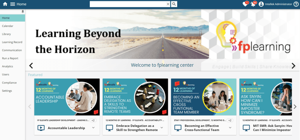
What makes this approach effective is the careful attention to color psychology. The client selected eye-catching yet welcoming color schemes, inviting and not overwhelming learners. This creates an environment where employees feel comfortable exploring content and completing learning instead of experiencing the typical corporate training fatigue.
Perhaps most impressively, instead of generic stock images that people encounter everywhere online, their branded visuals create an experience that feels built specifically for their team members. This approach pays dividends in engagement metrics, as people respond more positively to materials that feel intentionally created for them and not mass-produced.

By treating their LMS as an extension of their brand experience and not just a functional tool, this organization has created a learning environment that employees want to visit, leading to more training completion.
Beyond Stock: Personalization with Custom Imagery
Another standout example shows how personalization transforms the learning experience. This client maintains consistent LMS styling throughout their implementation but takes the concept further with completely custom imagery for training categories.
This organization invested in custom-made eLearning library images for different content types. Rather than relying on generic stock imagery that screams “CORPORATE TRAINING!” – these purpose-built visual cues help organize content while reinforcing brand identity. The result is an LMS content library that feels intentionally curated and not hastily assembled.
Note: For data protection reasons, we have removed the client’s logo from these images.
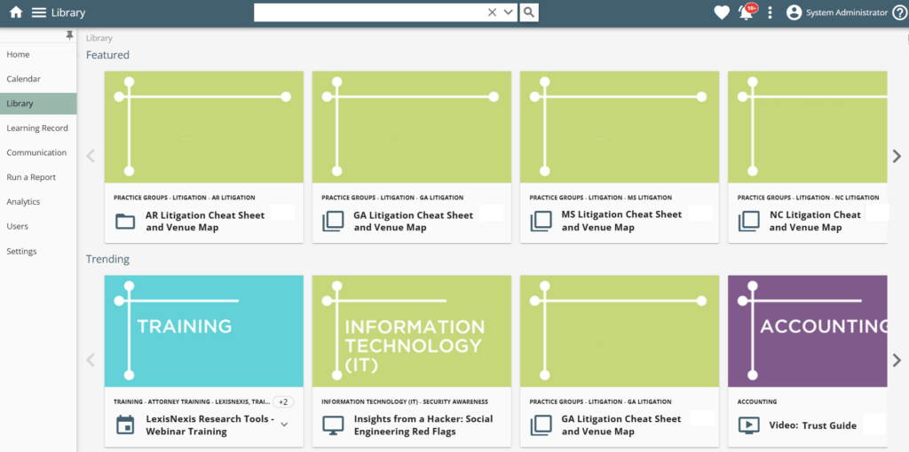
The firm also leverages Intellek’s featured and trending content carousels strategically. By highlighting trending LMS learning paths prominently on both the homepage and in the library, they create multiple entry points to priority learning. This approach makes critical training materials more accessible while subtly guiding users toward high-value content without forcing navigation.
The combination of pleasant color choices and custom imagery creates an inviting atmosphere that transforms mandatory training into something more approachable.
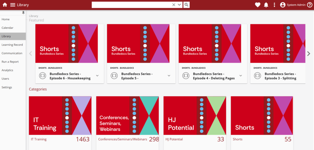
Visual Clarity through well-chosen Icons
This particularly effective LMS customization demonstrates how thoughtful iconography can dramatically improve the user experience. This client uses custom icons that communicate content themes at a glance, allowing staff to quickly identify the materials most relevant to their needs.
The visual system they developed serves multiple purposes: it helps categorize content, creates visual interest, and reduces cognitive load for those trying to find specific resources. Rather than forcing people to read descriptions or click through to understand what content contains, these purpose-built icons create instant recognition.
This approach recognizes that in busy work environments, employees need efficiency in their learning tools. By investing in visual communication through custom icons, you can remove friction from the discovery process and speed learners toward the content they need.
Minimalist LMS Design: Proving less can be more
Not every effective LMS design relies on bold colors or elaborate graphics. One client example demonstrates the power of minimalism in learning management systems. Their deployment takes a restrained visual approach that proves equally effective at driving engagement and training completion.
The clean, uncluttered interface creates a sense of calm organization that makes training materials easy to distinguish and access. By avoiding visual overload, this LMS design reduces distraction and helps retain focus on the actual learning content without navigating a complex interface.

This example serves as an important reminder that “engaging” doesn’t necessarily mean “flashy.” The minimalist design creates an environment where the content itself becomes the focus, not competing with decorative elements for attention. For organizations with more conservative visual identities, this example shows how clean design can be just as inviting as more colorful, snazzy approaches.
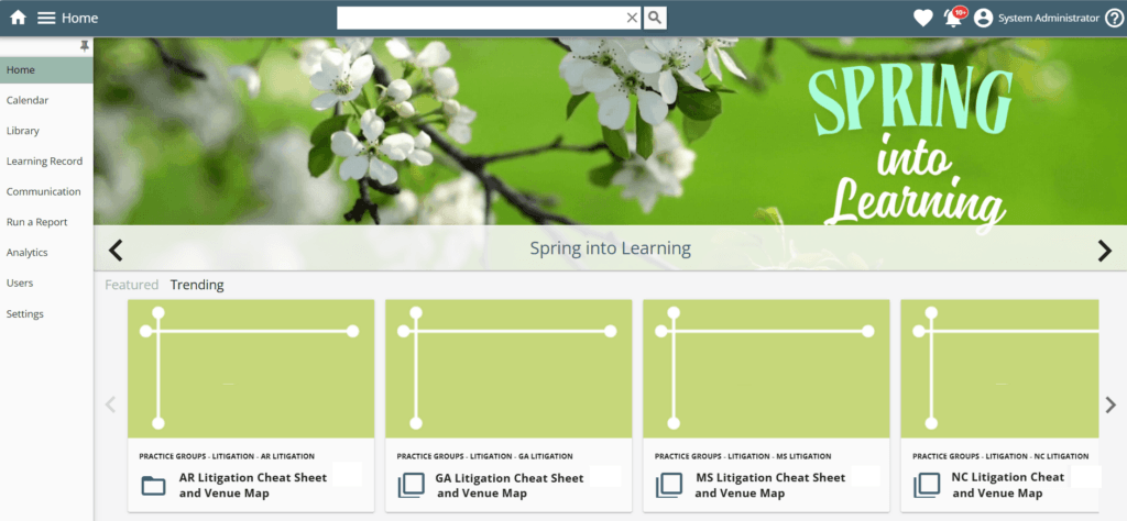
Highlight Training Content to Guide the Learning Journey
These final examples showcase how important content promotion can direct user behavior and encourage training completion. This implementation strategically positions featured learning content on both the LMS dashboard design and within content libraries, creating multiple opportunities for employees to discover priority training content.
Another firm uses the dashboard banner element and featured carousel effectively, maintaining color consistency to create a cohesive experience while drawing attention to high-priority materials. This approach helps learning administrators guide people toward specific content without restricting exploration.
By thoughtfully designing these promotional elements to match the overall visual system, the featured training content feels like a natural part of the LMS layout and experience, not an intrusive promotion. Learners perceive suggestions as helpful guidance rather than pushy instruction.
LMS Client Achieves Boost in Training Engagement
The impact of choosing the right learning management system goes far beyond features and functionality – it directly affects training outcomes. One Intellek LMS client demonstrated this dramatically, reporting a staggering 264% increase in employee uptake of eLearning materials after implementing the platform. This remarkable improvement showcases how the right LMS can transform an organization’s training ecosystem.
While many factors contribute to training success, this client’s experience highlights how Intellek’s platform capabilities enable organizations to create learning environments where employees actively seek out development opportunities. This surge in voluntary engagement translated directly to higher training completion rates as employees no longer viewed training as an obligation to avoid but as a valuable tool for their professional development.
For learning and development teams struggling with low completion metrics, this case illustrates how selecting a robust, user-friendly LMS can convert reluctant learners into active participants, creating a measurable return on investment for both the platform implementation and the training content itself.
How can I make my LMS better?
To improve your existing LMS, focus first on creating visual consistency throughout the platform. Review your current implementation for disconnected design elements that might confuse users, and develop a cohesive visual language that makes navigation intuitive.
- Replace generic stock imagery with custom visuals that reflect your organization’s identity. This simple change can transform how employees perceive training, from generic corporate material to content specifically created for their development.
- Implement clear visual categorization systems. Develop custom icons or color-coding for different content types to help users quickly identify materials relevant to their needs. This reduces the time employees spend searching and increases time spent learning.
- Strategically position high-priority content using featured carousels and dashboard promotions. Create multiple entry points to important training materials without forcing navigation paths. Make suggestions feel helpful rather than mandatory.
- Consider content accessibility. Ensure your design accommodates different learning preferences and needs. This includes clean layouts that work well on various devices and thoughtful color choices that maintain readability.
Most importantly, gather feedback from actual users. The best improvements come from understanding what’s currently working and what’s creating friction for your specific audience. Small adjustments based on real user feedback often yield the biggest engagement improvements.
Key Takeaways and What To Do Next
Despite their visual differences, these LMS design examples share common principles that drive training completion. Whether using vibrant colors or minimalist designs, you should prioritize consistency, intentional visual systems, and user-centered design thinking.
The most successful implementations treat their learning management system as more than just a repository for training materials. Instead, you must approach it as a digital environment where visual design directly impacts how employees engage with learning content.
Law firms looking to increase training engagement should consider how their current LMS implementation might benefit from similar design thinking. Small improvements in visual consistency, custom imagery, clear iconography, and strategic content highlighting can transform an underused system into an engaging learning hub.
Drive Training Completion with Your LMS Design
By focusing on the user experience and treating LMS design as a critical component of learning strategy and not an afterthought, organizations can dramatically improve how employees interact with training content. In the competitive talent landscape, these details make the difference between training that feels like an obligation and learning that feels like an opportunity.
If your current system can’t deliver these design improvements, don’t settle for lackluster training engagement. Book a demo with our team to see Intellek LMS in action – it will be customized with your firm’s branding before you even arrive! You’ll immediately grasp how your visual identity can enhance your learning programs.
See firsthand how attorneys and staff might interact with a system that feels built specifically for your practice rather than wrestling with generic interfaces. Our tailored demos show exactly how your training could look and feel, making it easy to envision the impact on your team’s engagement. Reach out today to experience the difference thoughtful design makes.

Intellek (formerly TutorPro) is a founding member of the learning technology industry. With a presence in the USA, UK, Canada, and the EU – for over 30 years we have pioneered the development of cutting-edge eLearning software and online training solutions, with a large and diverse portfolio of international clientele.
Disclaimer: We use all the tools available including generative AI to create relevant and engaging content.